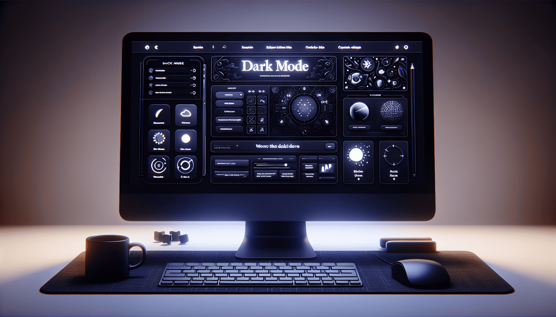
In recent years, the digital landscape has witnessed a notable shift in web design with the widespread adoption of dark mode. What began as an optional aesthetic choice is rapidly becoming a staple feature in user interfaces across devices and platforms. This trend signifies more than just a passing fad; it embodies a fundamental change in how designers and users interact with digital content.
Reasons for Popularity
-
Improved Visual Comfort: Dark mode is lauded for its ability to reduce eye strain, particularly in low-light environments. With the increasing amount of time users spend on screens, comfortable viewing is paramount. Dark mode minimizes the glaring white backgrounds of traditional interfaces, easing the transition from digital displays to ambient room lighting.
-
Battery Efficiency: For devices with OLED and AMOLED screens, dark mode offers tangible energy savings. These screens illuminate individual pixels, meaning darker pixels require less power. Users can enjoy longer battery life without compromising on performance, making dark mode a practical choice for mobile users.
-
Modern Aesthetic Appeal: The sleek and sophisticated look of dark mode caters to contemporary design preferences. It offers a distinct and stylish alternative that resonates with users seeking a fresh aesthetic. The use of high-contrast elements and vivid colors can create striking visual hierarchies, enhancing user engagement.
-
Focus on Content: By reducing the dominance of bright background colors, dark mode allows content to take center stage. This shift in focus can improve readability and concentrate user attention on the task at hand, whether it's reading an article or browsing a product catalog.
Implementing Dark Mode Effectively
-
Adaptive Design: A successful dark mode implementation should be adaptive rather than complete redesign. Ensure that all components of your website transition smoothly between light and dark modes. This includes icons, images, and typography adjustments to maintain readability and brand consistency.
-
Color Contrast and Accessibility: Be mindful of color contrast to ensure readability for all users. The design should adhere to accessibility standards, such as the Web Content Accessibility Guidelines (WCAG). High contrast levels facilitate better readability, which is crucial for users with visual impairments.
-
User Control: Offer users the option to toggle between light and dark modes. Some users may prefer the traditional light mode, and providing them with a choice caters to varied preferences. A simple toggle switch in the website’s settings can enhance user satisfaction and engagement.
-
Testing Across Devices: Ensure that dark mode functions seamlessly across all devices and screen sizes. Rigorous testing and feedback collection can help identify any issues early on. A consistent experience, regardless of the device, strengthens user trust and loyalty.
-
Consider Psychological Effects: While dark mode can be easier on the eyes, prolonged exposure can sometimes lead to feelings of melancholy or reduced alertness. Balance this by allowing intervals of light mode usage or using warmer tones.
In conclusion, dark mode is more than a fleeting trend; it is an integral part of modern web design that aligns with contemporary user preferences and technological advancements. By focusing on visual comfort, energy efficiency, and aesthetic appeal, dark mode creates a more engaging and sustainable user experience. Effective implementation is key, requiring thoughtful design principles and a commitment to accessibility. As more users embrace this mode, designers have a unique opportunity to innovate and enhance the digital experience for everyone.
